
Regardless of whether you create content using a template, or start from a blank page, the Email Designer interface includes a series of standard elements:
- The Template management page.
- The Content editing page.
- The Editing panel.
- The Timeline management buttons.
- The right Sidebar.
- The Editing panel.
- The Content tab.
- Content frame and controls.
- Content block controls.
- Text editor controls.
- The Rows tab.
- Row Structure frame and controls.
- Row and column property controls.
- Row Properties.
- Column Properties.
- The Settings tab.
- Color selection controls.
The Template management page
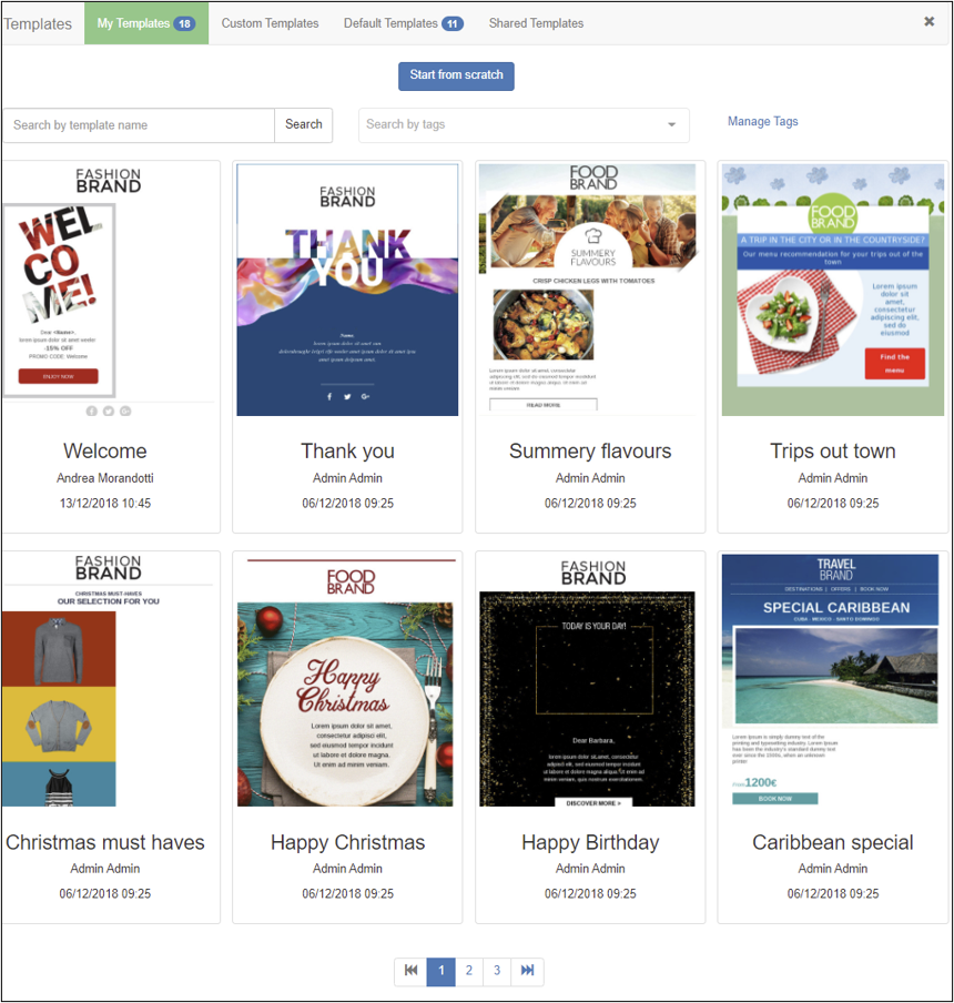
Example of the Template management page
The Template management page includes:
- A Start from scratch button.
Click to start creating email content or a template from a blank page. - Tabs with lists of available templates.
Click a tab and select a template to start using it as the basis for email content or a new template.
Templates are organized in the following repositories:- My Templates.
The templates that users have created or customized. - Custom Templates.
Paid-for templates, provided according to specific customer needs. - Default Templates.
Templates Contactlab provides by default to all customers. - Shared Templates.
Only displays for associated companies or brands, when the parent organization has shared a template for general use.
- My Templates.
The Content editing page
- The Actions button.
Click to:- View a desktop or mobile preview of the current page.
- Perform a delivery test of the email content to one or more recipients of your choice.
- Save the current work as a template.
- The Show structure button.
Displays the overall structure of the content layout in the email Editing panel. - The icons in the top left-hand corner allow you to move from mobile to desktop mode and vice-versa while editing content. This way you can take action and view the changes you are making in real-time.
- The Editing panel.
The area where you create or edit email content or a template. - The right Sidebar.
The area where the formatting controls display.
It includes the following tabs:- Content.
- Rows.
- Settings.
- The HTML download botton.
If you decide to download the html in this window, the downloaded version is the one that is currently displayed, including any changes you have made since the last save.
When editing an element, the heading of the Content and Rows tabs also include the following buttons:
- Delete.
Click to delete the associated block from the Editing panel.
Note:
This action cannot be reversed. - Duplicate.
Click to create a duplicate of the relevant block immediately beneath the original. The duplicate also includes exactly the same content as the original. - Collapse.
Hides the relevant Content or Row properties. Click the block to display them again.
The Editing panel
The Editing panel is where you create email content or a template, or edit existing material, by:
- Dragging and dropping tiles from the sidebar tabs, to create the blocks that make up the overall structure and content.
- Moving blocks to the appropriate positions.
- Adding the appropriate content, such as text, images, link buttons and similar.
- Deciding to which recipients specific content will be visible.
Timeline management buttons
Once you have started to create an email, three timeline management buttons automatically display in the bottom left corner of the Editing panel:
- The History button.

Displays a timeline of up to the last 15 steps or changes that have taken place in the current session. It enables you to go back to an appropriate step in the creation process, if required.
To close the timeline, click the History button again. - The Undo button.

Enables you to move backwards one or more steps in the creation process. - The Redo button.

Enables you to move forwards one or more steps in the creation process, provided that you have already used the Undo button or the timeline.
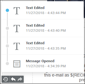
The timeline management buttons with the timeline displayed
When you select a previous step in the timeline, the content, column or row that was edited displays as the selected item, providing further context.
Note:
If you just go back in time without making changes, the timeline of more recent steps remains available. This allows you to move forward again, without losing any of the edits. However, if you navigate back to a previous step and make changes, or add new ones after it, all steps that follow the one in the timeline you have selected are lost. For example, if you add a Text block followed by an Image and a link Button, then you go back and edit the text, the Image and Button blocks are deleted.
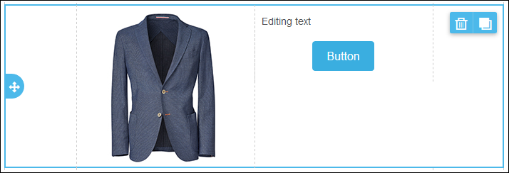
The Content tab
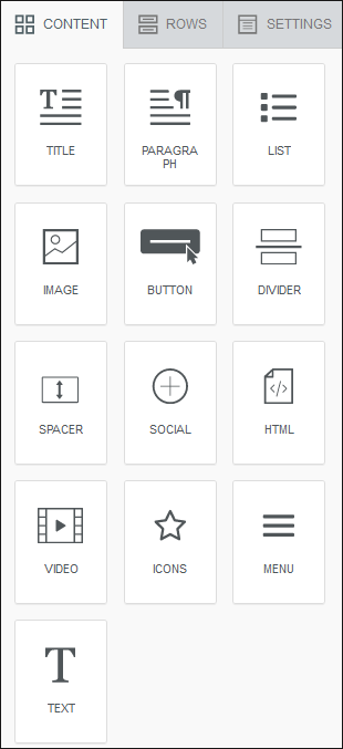
Example of the Content tab
The Content tab consists of a series of tiles representing different types of content that you can add to your message in the Editing panel, for example:
- Title.
- Paragraph.
- List.
- Text.
- Image.
- Button.
- Divider.
- Spacer.
- Social.
- HTML.
- Video.
- Icons.
- Menu.
- Title.
To use a tile, drag and drop the one you require to the appropriate column and row in the Editing panel. The resulting content block automatically adjusts to the column width. You cannot add more than one block horizontally to a column, but you can stack them vertically. See the Rows tab for more about columns and rows.
Content frame and controls
When you hover your mouse over a content block, a Content frame displays.
Click the frame to display three buttons:
- Re-positioning arrows.
These enable you to drag and drop the relevant content block above or below another block, or to a different column or row in the Editing panel. For example, an empty column in the next row. - Delete.
Click to delete the associated block from the Editing panel.
Note:
This action cannot be reversed. - Duplicate.
Click to create a duplicate of the relevant block immediately beneath the original. The duplicate includes exactly the same content as the original.
You can move the duplicate to a different location, using its Re-positioning arrows, if required.
Content block controls
When you click a content block in the Editing panel, the appropriate Content properties display within the Content tab, which you can adjust as required.
Each content type has its own set of properties:
Title
The Title properties include:
- Content Properties:
- Title: H1, H2, H3.
- Font family.
- Font weight: bold, standard.
- Font size.
- Text color.
See the Settings tab for more about the Color selection controls. - Link color.
Overrides the Settings tab Link color. - Align.
Title justification right, centre, left. - Line height.
Defines the distance between the lines of text. - Letter spacing.
Increase or decrease the space between letters. - Text direction.
- Block options:
- Padding.
Overrides the Rows > Column Properties > Padding settings. - All sides.
Defines the space around the title. - Hide on mobile.
If set, it hides the relevant design and/or content element when the message displays on mobile devices.
- Padding.
Paragraph
The Paragraph properties include:
- Content Properties:
- Font family.
- Font weight: bold, standard.
- Font size.
- Text color.
See the Settings tab for more about the Color selection controls. - Link color.
Overrides the Settings tab Link color. - Align.
Title justification right, centre, left. - Paragraph spacing.
Increase or decrease the space between paragraphs in the same block. - Line height.
Defines the distance between the lines of text. - Letter spacing.
Increase or decrease the space between letters. - Text direction.
- Block options:
- Padding.
Overrides the Rows > Column Properties > Padding settings. - All sides.
Defines the space around the title. - Hide on mobile.
If set, it hides the relevant design and/or content element when the message displays on mobile devices.
- Padding.
List
The List properties include:
- Content Properties:
- List type.
- List style type: default, disc, circle, square.
- Font family.
- Font weight: bold, standard.
- Font size.
- Text color.
See the Settings tab for more about the Color selection controls. - Link color.
Overrides the Settings tab Link color. - Align.
Title justification right, centre, left. - List items spacing.
Increase or decrease the space between elements in the same list. - List items indent.
- Line height.
Defines the distance between the lines of text. - Letter spacing.
Increase or decrease the space between letters. - Text direction.
- Block options:
- Padding.
Overrides the Rows > Column Properties > Padding settings. - All sides.
Defines the space around the title. - Hide on mobile.
If set, it hides the relevant design and/or content element when the message displays on mobile devices.
- Padding.
Image
Note:
The Image content type properties are unavailable until you add an image to the relevant content block in the Editing panel.
The Image properties include:
- Content Properties:
- Auto width.
If selected, the image width is automatically set to 100%.
If deselected, you can manually define the image width. - Full width on mobile.
Ensures the image displays at the full width of a mobile’s screen. - Align.
- Dynamic image.
Enables you to include a dynamic image in the email content or template.
The image link is a URL that contains variables, such as an email address, the customer name, a date or similar. The variables are replaced with actual values when the email is sent. - The current Image name.
Click Change image to use a different one.
If you want to apply visual effects or edit the image, click Apply effects & more. - URL.
The URL of the current image. - Alternate text.
- Auto width.
- Action:
- Image link.
Defines what happens if the image is clicked, for example, Open web page. The fields that follow vary according to the option selected in this field.
- Image link.
- Block options:
- Padding.
Overrides the Rows > Column Properties > Padding settings. - Hide on mobile.
If set, it hides the relevant design and/or content element when the message displays on mobile devices.
- Padding.
Button
The Button properties include:
- Action:
- Link type.
Defines what happens if the button is clicked, for example, Open web page. The fields that follow vary according to the option selected in this field.
- Link type.
- Button options:
- Auto width.
If selected, the button width is automatically set according to the button text.
If deselected, you can manually define the button width.
Note:
If the button text is selected, the Text editor controls also display. - Background color.
See the Settings tab for more about the Color selection controls. - Text color.
- Align.
- Line height.
Defines the distance between the lines of text within the button. - Letter spacing.
Increase or decrease the space between letters. - Border radius.
Defines the curvature of the button ends. - Content padding.
Defines the padding that surrounds the buttons content.
A small graphic displays the result.
Select More options to define the padding for each side individually. - Border.
Defines the border color.
- Auto width.
- Block options:
- Padding.
Defines the padding that surrounds the button within the content block.
A small graphic displays the result.
Select More options to define the padding for each side individually. - Hide on mobile.
If set, it hides the relevant design and/or content element when the message displays on mobile devices.
- Padding.
Divider
The Divider properties include:
- Content Properties:
- Transparent.
If set, the Height control displays, which defines the height of the content block.
The Line, Width and Align controls are unavailable. - Line.
Defines the style, thickness and color of the line.
See the Settings tab for more about the Color selection controls. - Width.
Defines the length of the line in the content block, in percentage terms. - Align.
- Transparent.
- Block options:
- Padding.
Defines the padding that surrounds the divider within the content block.
A small graphic displays the result.
Select More options to define the padding for each side individually. - Hide on mobile.
If set, it hides the relevant design and/or content element when the message displays on mobile devices.
- Padding.
Spacer
- Content Properties:
- Height.
Block height dimensions.
- Height.
- Block options:
- Hide on mobile.
If set, it hides the relevant design and/or content element when the message displays on mobile devices.
- Hide on mobile.
Social
The Social properties include:
- Content Properties:
- Select icon collection.
Enables you to define the formatting of the social media icons.
Note:
Only those icons that are configured under Configure icon collection are displayed in the content block. - Configure icon collection.
Enables you to add, delete and configure the required social media icons.
Click the switch on each panel to display additional configuration options.
Click + Add new icon to include further social media icons. - Align.
- Icon spacing.
Click to define the horizontal spacing between icons.
- Select icon collection.
- Block options:
- Padding.
Defines the padding that surrounds the icons within the content block.
A small graphic displays the result.
Select More options to define the padding for each side individually. - Hide on mobile.
If set, it hides the relevant design and/or content element when the message displays on mobile devices.
- Padding.
HTML
The HTML properties include:
- Content Properties:
An HTML editor to enter responsive HTML as required.
Note:
It is assumed that you know and understand responsive HTML code. The editor does not perform any error checks. - Block Options:
- Hide on mobile.
If set, it hides the relevant design and/or content element when the message displays on mobile devices.
- Hide on mobile.
Video
The Video properties include:
- Content Properties:
- Video URL.
- Block options:
- Padding.
Defines the padding that surrounds the video within the content block.
A small graphic displays the result.
Select More options to define the padding for each side individually. - Hide on mobile.
If set, it hides the relevant design and/or content element when the message displays on mobile devices.
- Padding.
Icons
The Icons properties include:
- Content Properties:
- Add new icon.
Enables you to add and configure the required icons.
Apply effects and more.
More options: insert URL, alternative text and other links.
Click + Add new icon to include further icons. - Align.
- Font details.
- Icon details.
- Icon Padding.
Defines the padding that surrounds the icon.
Select More options to define the padding for each side individually.
A small graphic displays the result.
- Add new icon.
- Block options:
- Padding.
Defines the padding that surrounds the content block.
A small graphic displays the result.
Select More options to define the padding for each side individually. - Hide on mobile.
If set, it hides the relevant design and/or content element when the message displays on mobile devices.
- Padding.
Menu
The Menu properties include:
- Content Properties:
- Add new item.
Enables you to add and configure the menu.
Add URL, text and title.
Click + Add new item to include further icons.
You can modify the order of the items in the menu clicking on the icon at the top on the left of each single box. - Font details.
- Align, Layout, Separator.
- Manage the Mobile version/Hamburger menu.
- Items Padding.
A small graphic displays the result..
- Add new item.
- Block Options:
- Padding.
Defines the padding that surrounds the content block.
A small graphic displays the result.
Select More options to define the padding for each side individually. - Hide on mobile.
If set, it hides the relevant design and/or content element when the message displays on mobile devices.
- Padding.
Text
The Text properties include:
- Content Properties:
- Text color.
See the Settings tab for more about the Color selection controls. - Link color.
Overrides the Settings tab Link color. - Line height.
Defines the distance between the lines of text. - Letter spacing.
Increase or decrease the space between letters.
- Text color.
- Block options:
- Padding.
Overrides the Rows > Column Properties > Padding settings. - Hide on mobile.
If set, it hides the relevant design and/or content element when the message displays on mobile devices.
- Padding.
If you click a Text block, typical Text editor controls also display.
The Rows tab
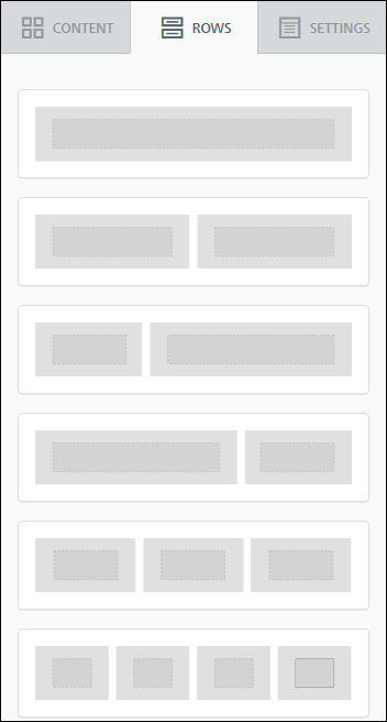
Example of the Rows tab
The Rows tab consists of a series of tiles representing different column configurations within a row. To use a tile, drag and drop the appropriate one onto the Editing panel, to create a row block. The resulting columns in the row block automatically adjust their width to that of the Content area width. See the Settings tab for more about the Content area width.
These row blocks are where you drag and drop the content tiles. You can use any combination of row blocks to define the overall layout of your email content or template. However, it is generally recommended that you keep the layout simple, so you do not risk confusing the recipient with an over complicated design.
NOTE: In this tab you can decide how to preset the display of single lines according to the target of your emails. To learn how to set conditions and activate filters, read also Conditional Email Designer.
Row Structure frame and controls
When you hover your mouse over a row block, a Structure frame displays.
The row structure frame
Click the frame to display three buttons:
- Re-positioning arrows.
These enable you to drag and drop the relevant row block to a different position in the Editing panel. For example, beneath another row block. - Delete.
Click to delete the associated block from the Editing panel.
Note:
This action cannot be reversed. - Duplicate.
Click to create a duplicate of the relevant block immediately beneath the original. The duplicate also includes exactly the same content as the original.
You can move the duplicate to a different location, using its Re-positioning arrows, if required.
Row and column property controls
Click the Structure frame of a row block to display its Row properties and Column properties in the Rows tab.
Row Properties
The Row properties include:
- Row background color.
- Content background color.
- Do not stack on mobile.
Prevents the columns in the row from being stacked on a mobile device.
Note:
This is useful when managing, for example, how a navigation bar displays. However, this should be used with caution, to ensure that a user-friendly vertical layout on mobile devices is maintained as far as possible. - Reverse stock order on mobile.
Allows you to change the arrangement of the elements in your row blocks on a mobile device. You can decide to stack them in reverse order while maintaining a pleasing display. - Row background image.
Enables a background image to be added to a row, by giving the appropriate URL.
You can select whether the image should cover the full width of the row, be repeated or centered, and also apply a range of visual effects, by clicking the Apply effects & more button.
If back ground images are not supported by an email program, the Row background color is displayed instead. - Display condition.
Click to open a new window where you can enter conditional statements. - Filter conditions. It allows you to differentiate email content according to the target to be reached by associating appropriate filters to single lines. These filters are represented by the set of conditions on the values of the fields of the User Db to be associated with the template. Also read Conditional Email Designer.
Column properties
The Column properties include:
- Column background.
- Padding.
Enables you to define the padding for all sides of the column, or individually for each side when More options is selected. - Border.
Enables you to define the border for all sides of the column, or individually for each side when More options is selected.
Different column property tabs display for each column in the row.
The Settings tab
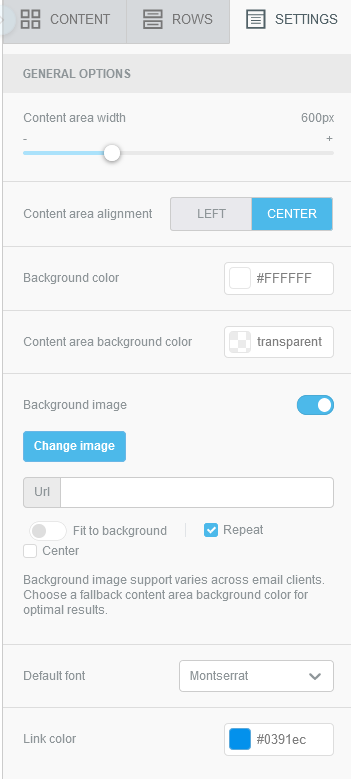
Example of the Settings tab
The Settings tab includes the basic and general formatting options for the email content or template, such as:
- Content area width.
Applied as a maximum width when a device has a large screen with a high resolution. This setting is ignored on small devices. - Content area alignment.
- Background color.
Can be overridden at the Row, Column, and Content block level, as required. - Content area background color.
Can be overridden using the Row properties, but not with the Content block controls or the Text editor controls. - Background image.
Possibility of inserting an image as template background. By default, the image is used at its original resolution and does not scale to fit the display. To improve the display, you can adapt it to the entire background and the image will resize, center or repeat over the entire background several times in vertical space. - Default font.
Can be overridden at the Content block level. - Link color.
Can be overridden for individual elements.
Color selection controls
When you click a color-related selection field in a Sidebar tab, for example, Background color in the Settings tab, the Color selection window displays.
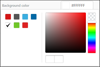
Example of the Color selection window
You can:
- Select a predefined color, positioned to the left of the window.
- Use the color controls to select a custom color, or enter its Hex.
If you click the checkered field, the color is set to transparent.
If you choose a custom color, it is displayed as a predefined color, the next time the color selection window is used.
When selected, the color reference is displayed as a Hex, for example #FFFFFF, for white.