
The “Analyse > Campaign” allows the monitoring of a series of indicators of users activity, engagement and sending pressure, for the recipients of your campaigns.
Charts and tables also show how those values change over time, providing you precious information for informed decision making about your marketing strategy.
This area divides into four parts: Recipients Summary, Campaigns Summary, Engagement Index, Pressure Index.
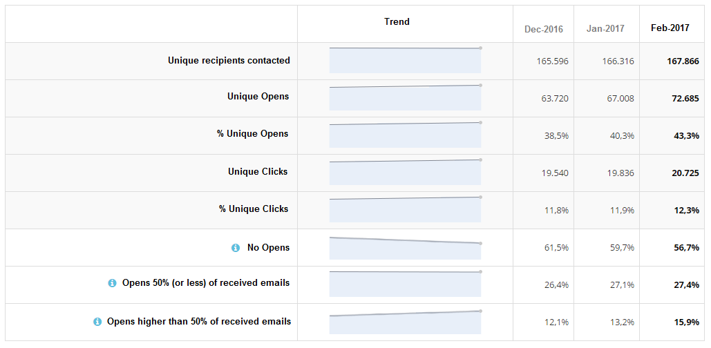
Recipients Summary
Here you find the key metrics about the recipients of your email campaigns:
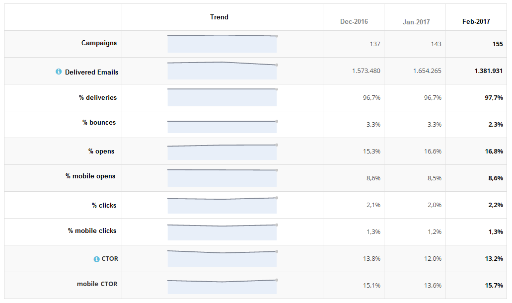
Campaigns Summary
Here you find the key metrics about your email campaigns:
Engagement Index
This index describes the engagement level of your recipients on the emails they receive.
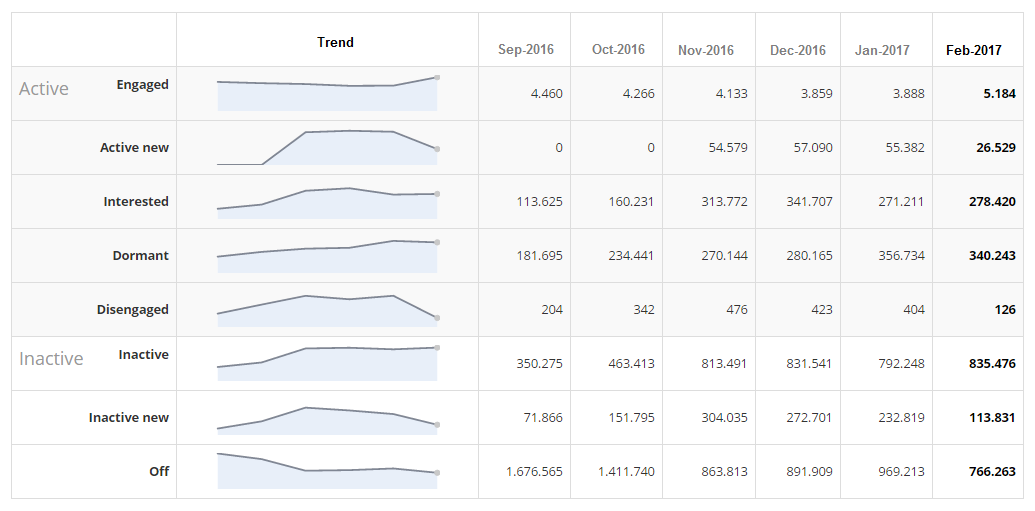
The index is build by a proprietary algorithm that uses users behaviour (opens and clicks) on email campaigns received in the relevant period.
Each engagement level is represented by a standard cluster:
- Engaged: Users in the database from at least 3 months, who received regular communications and have recently opened and/or clicked.
- Active new: Users in the database from at least 3 months, who received regular communications and have recently opened and/or clicked at least one time.
- Interested: Users in the database from at least 3 months, who received regular communications and have recently opened and/or clicked few times.
- Dormant: Users in the database from at least 3 months, who received regular communications and have opened and/or clicked few times, not recently.
- Disengaged: Users in the database from at least 3 months, who received regular communications and had opened and/or clicked many times, not recently.
- Inactive new: Users in the database from at least 3 months, who received regular communications and have done no activity.
- Inactive: Users in the database from at least 3 months, who received regular communications and have not opened nor clicked.
- Off: Users not contacted recently.
The data in each column is built using data from campaigns received in the past 12 months. For example, data in the “January 2017” column use data from campaigns betweeb February 1st 2016 and January 31st 2017.
Pressure Index
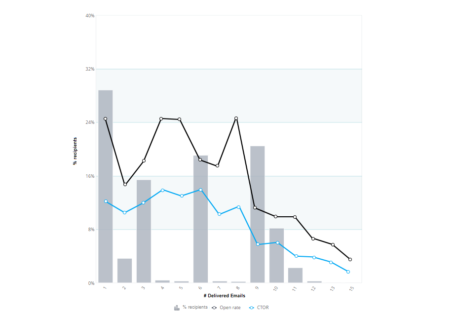
The Pressure Index is a chart that shows the sending pressure of our campaigns, distributing the number of received emails over the number of recipients.
In the chart we can see how many users have received 1 email within the considered time frame, how many got 2, how many got 3, and so on.
The black and blue lines show the open and click (CTOR) rates for each pressure cluster. This allow us to find an ideal preassure level to maximize clicks and opens, and build our own “do not disturb” limit (the number of messages that makes performances sharply decrease).
In this article we present an example about how reading those indicators to find out more about you communication strategy impact on your customer base.