
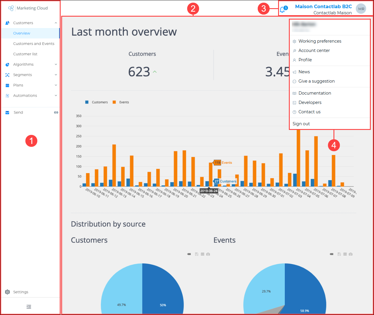
Example of the Marketing Cloud components
The Marketing Cloud UI is made up of four distinct areas:
- The Sidebar (1).
- The Main window (2).
- The Information panel (3).
- The Options drop-down panel (4).
The Sidebar
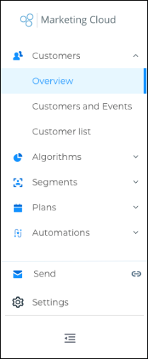
The Sidebar normal view with Customers > Overview selected
The Sidebar enables you to directly access all the pages of each Marketing Cloud section. For example, when you click Customers, links to its Overview, Customers and Events and the Customer list pages display.
Note:
The sections that are active in the sidebar depend upon your permissions. Only the sections you have access to can be highlighted and clicked.
The Sidebar itself can be displayed in two formats:
- The normal view.
Displays the segment names and their associated icons. - The compact view.
Only displays the segment icons.
Hover your mouse over the appropriate segment icon to display links to its pages.
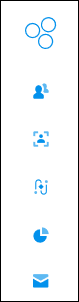
The Sidebar compact view
If you use, for example, a tablet to access the Marketing Cloud UI, you may need to toggle the Sidebar to the compact view, to be able to see more of the selected page in the Main window.
Toggling between the Sidebar views
To toggle between the normal and compact Sidebar views, do the following:
• To change to the compact view, click the Contract icon  , positioned at the foot of the Sidebar normal view.
• To change to the normal view, click the Expand icon  , positioned at the foot of the Sidebar compact view.
Section icons
The section icons are as follows:
 |
Account Center |
 |
Customers |
 |
Algorithms |
 |
Segments |
 |
Plans |
 |
Automations |
 |
Send |
The Customers section page is selected by default.
The Main window
The Main window is where the selected section page is displayed, allowing you to carry out the planned operations.
Note:
If you click Send in the Sidebar, the section displays in a separate browser tab.
The Information panel
The Information panel displays the names of the currently selected Node and Workspace, together with the initials of the user.
The bell-shaped Notifications icon  , enables you to view any available news about the Contactlab Marketing Cloud.
Click the Information panel to display the Options drop-down panel.
The Options drop-down panel
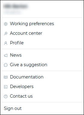
The Options drop-down panel
The Options panel enables you to:
- Change your Working preferences.
Click to change the Company, Workspace and/or Node that you are using. - Access the Account Center.
Note:
The pages that are available depend upon your access permissions. The Account Center Admin settings are available if you have the appropriate permissions, in the main Settings section of the UI. See Getting started, selecting the initial workspace and using the UI for more details. - View and/or edit your personal Profile.
Click to display the Account Center > Your account page in the Main window. - View the latest Contactlab News.
Click to display the news in the Main window. - Give a suggestion to Contactlab.
Click to display the Contactlab feedback page in a separate browser window. - Access this User documentation.
Click to display the section pages in a separate browser window. - Access the Developer documentation for each module.
Click to display the Contactlab developer site in a separate browser window. - Contact us.
Click to display the Help Center page in a separate browser window. - Sign out.
Click to end the current Marketing Cloud UI session.