
Recently, Forrester research showed that 4 out of 5 people were dissatisfied with the user experience that brands offer them.

We at Contactlab, however, have always had the aim of giving our customers the best interaction experience possible while using the Marketing Cloud.
With this in mind, our commitment to the design and re-design of the platform was born… and continues today.
Why ‘Design‘?
Because it is the first thing the user interacts with, when accessing the platform.
Design plays a predominant role in creating a perfect user experience. It must blend in seamlessly both with the information architecture and the overall UX appearance. In fact, it is now considered by many to be fundamental in determining the success of an application or site.
As a result, our experts have been devoting their efforts and energy to creating a new UI for some time now – the first version of which is already available to all Marketing Cloud users. Now, we have decided to share some articles with you, to explore the background of the Contactlab UI, how we worked and are continuing to work in this direction.
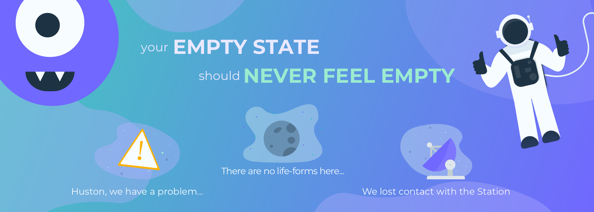
Let’s start with the Empty State…
This is one of the most exciting features of the new UI. We thought about a user-friendly and simplified journey through the platform. Navigation supported by images, themed illustrations and dedicated messages, to let users know what is happening and manage their adventure within the Marketing Cloud. The empty states help us do this.
Some visual forms can fascinate while not always being fully comprehensible, but the navigation interfaces cannot afford this luxury. When we talk about a beautiful digital platform, we must mean that it is immediately understandable, and not just some animated icon.
So, first of all we focused our attention on the use of the empty state – literally an empty state – those screens that, for one reason or another, do not return results to the user.
General principles
Empty states play an important role in the use of digital products and are extremely versatile. They enable the user to receive accurate and specific suggestions, in the context in which they are shown. This always makes them feel guided and never abandoned to navigate alone.
Some of the goals we agreed when deciding to use them, are:
- Educate people how to use the application. The easiest way to do this, is to always treat empty states as if someone is seeing them for the first time.
- Arouse the curiosity of users. You need to create a strong first impression to make people curious. A fresh, personal message that makes someone smile, while dampening any potential negative impact of missing data.
- Convey – that is, the ability to encourage users, and drive them to perform specific actions, or guide them.
The anatomy of an empty state
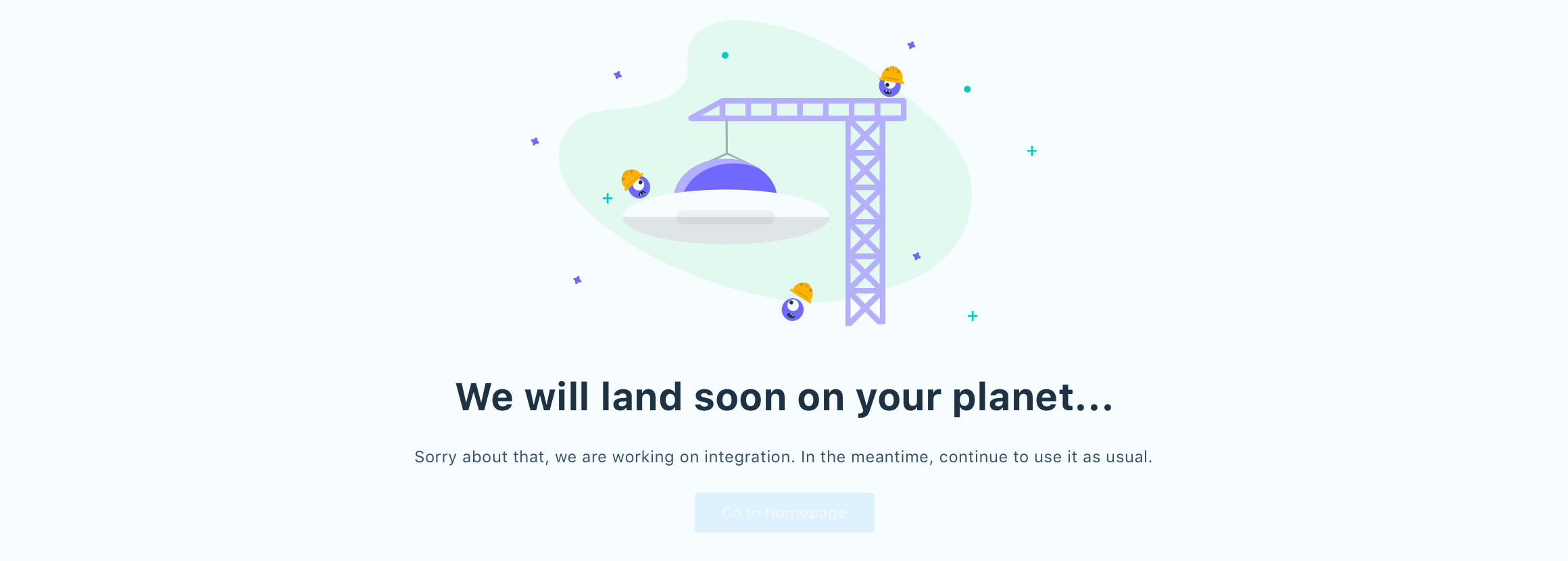
To be effective, an empty state must include a title, a supporting text and an action. If there is also an illustration to surprise the user, perhaps by focusing on humor or satire, then it would be a strong accompaniment to the text elements. So that’s what we did.
Below is a set of rules for each component, which ensure their correct use:
The illustration
 The illustration is the first visible element of the empty state. As a result, we use it to support the rest of the content.
We think it is useful to perform an action and we prefer humor to reduce the negative impact of the lack of content, which the user expects to find.
However, we discourage an illustration in the empty state, if there are others in the same section.
The title
 The title and the illustration are the elements that we usually place in the header of the empty state.
The general rules for correct use are:
- Clarity and conciseness.
- Any punctuation mark but a period at the end of the sentence should be avoided.
- The first letter of the sentence must be capitalized, the rest should be lowercase.
The supporting text
 The supporting text is the body of the empty state and we prefer:
- To use it to extend what has been conveyed by the title, using a simple and brief description.
- To use an informal and conversational tone, without being technical.
The action
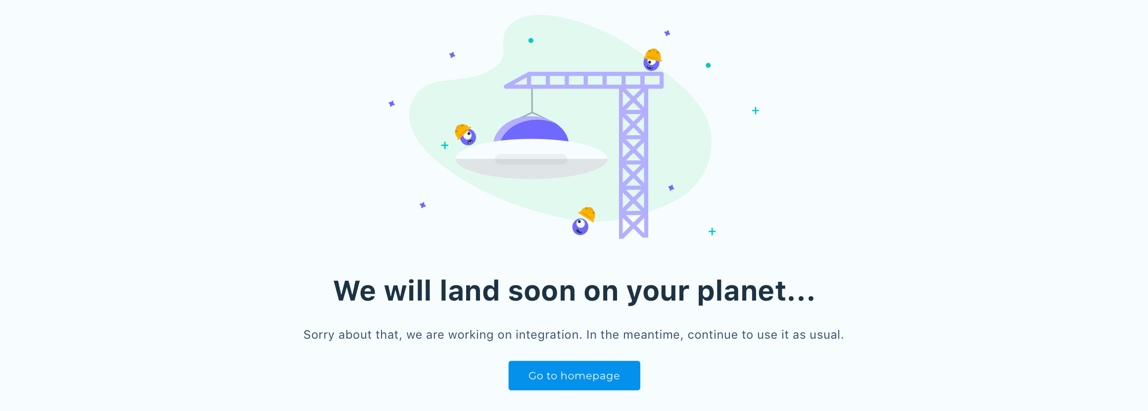 The action that we usually prefer, enables a user to activate a new feature, or to be guided through a given flow, when necessary.
It must be clear and predictable. Our user must always be able to infer the consequences of the action, and the result of the action must meet expectations.
Now…
It is clear that the empty states are one of the first things to consider in the re-design of the Marketing Cloud. In addition to their natural role as navigation facilitators, they help to reinforce something every platform should have, and that we too aim to achieve: A unique and clear identity, shared by every element. When anyone sees a screen, they must recognize it immediately, and know how to interact.
But the empty states are just the beginning. In the coming articles, there are other insights into why the new UI was designed and implemented as you see it today. Interesting ideas for creating a successful user interface. And a successful UI means better user experiences and, as a result, satisfied customers… with the inevitable and very positive implications for your business.
__________________
Discover the UX/UI Marketing Cloud series!
 |
 |
 |
 |
 |
||||
| EMPTY STATES | COLOR | TYPOGRAPHY |
ELEVATION |
STRUCTURE |