We can’t reveal everything, so to find out about the many new features contact us or enter the platform and start browsing. It will be easier than you can imagine. However, we would like to give you a sneak peek, because this is a great piece of work that we have carried out as part of the – always open – project to improve your user experience. Yes, because offering you tools that are fast, intuitive, easy to use and at the same time rich and with every response to your needs, is fundamental for us.
The impetus behind this lies in the fact that, with the collection and tracking of your customers’ data and behavior, and with the multiple points of contact and opportunities for communication, you find yourself with a truly vast amount of information. But not all of it is equally useful to your business. That’s why we think you need a marketing platform that can get you to what you’re looking for as quickly as possible, in the best possible way and in just a few steps.
Some news
Reorganisation and simplification of the contact database
From cards with all the information available – but not always necessary and often too much for your goals – to structured and organised profiles, where the really important data is immediately displayed. An optimisation of the header, an area with a clean design, which always remains visible even when you scroll the page. Maximum contextualisation to always remind you where you are and the information you need for your activities. Information spread over several tabs, immediately accessible.
New table navigation and filters
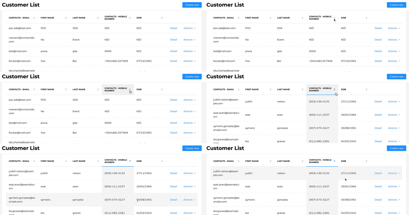
Dynamic tables where you can select the columns to be displayed and scroll through them, always keeping the email as a fixed point. Opportunity to sort rows by any visible field. A simplified contact search function and a new customer creation tab.
New smart components
The interface has been enriched with components aimed at improving the use of content both on the desktop and on mobile, with navigation further optimised for the tablet. A date and time selection mode, where it is possible to quickly indicate the period concerned by clicking on a mask that opens with the various options.
In addition, a secure interface that chooses illustrations to increase the protection of operations. The possibility of making irreparable mistakes, such as deleting a contact, is reduced, with the support of messages accompanied by clear, self-explanatory images that help avoid non-reversible actions.
Drill down into individual events
No more endless, long and scattered lists of events. From a vertical timeline to a heatmap where the events in the database are grouped into 5 categories that can be easily viewed on the screen. A set of events that can be consulted in detail by clicking on the box of interest. Applying an automatic filter on the selected category opens a complete drill-down. Possibility of creating new events in a data entry form with revised and lighter graphics to make the operation quick and safe.
Concluding
We have a lot more in the pipeline, so send us your feedback and requests through the Contactlab experts you are in contact with. Follow us and together we will live user experiences at the cutting edge.


