
Why do we invest a lot of resources in the constant and continuous evolution of the editor Email Designer? Often the relationship with your customers starts with an email. Being able to design and create attention-grabbing, navigable, easily usable emails, even on mobile, are the key to immediately bringing consumers on board and accompanying them in their choice of your products and services.
A great email template can become the key to increasing your conversions and invigorating your business.
What can you do with this release?
Vertical alignment
Columns within a single row can now be aligned along a vertical axis. To offer better email readability and visualisation, this release gives you more control over the layout of elements in multi-column templates, while improving your user experience.
The new feature supports the creation of your html when the content is not evenly distributed in the rows. You can choose between top, middle or bottom alignment options to align the content of any single row containing two or more columns.
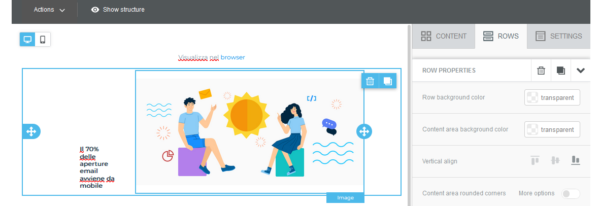
What does this mean?
Imagine a row with two columns: in the first you decide to use an image, in the second you insert text. You may have rows with different heights, ending up with a lot of space under the column with less content.
The entire row will always inherit the height of the tallest column. If the image is not as high as the text in the other column, the text content will occupy the entire row height and the image will be at the top of the row, with a lot of white space below it.
With this new function, you can decide the alignment, e.g. central, to create an equal amount of space above and below the image. If you prefer the image to be displayed at the bottom edge of the row instead, you can select the bottom alignment.
 |
 |
 |
 |