
The Analyse section of Contactsend, which is aimed at analyzing your email campaign results, gets a brand new area: Campaign Effectiveness. Its four charts display the relevant KPIs and how they change over time, giving you a global view of your campaign recipient’s behavior. This way, you can check the effectiveness of your communication strategy and enhance it as required.
The following example illustrates how you can best use this data.
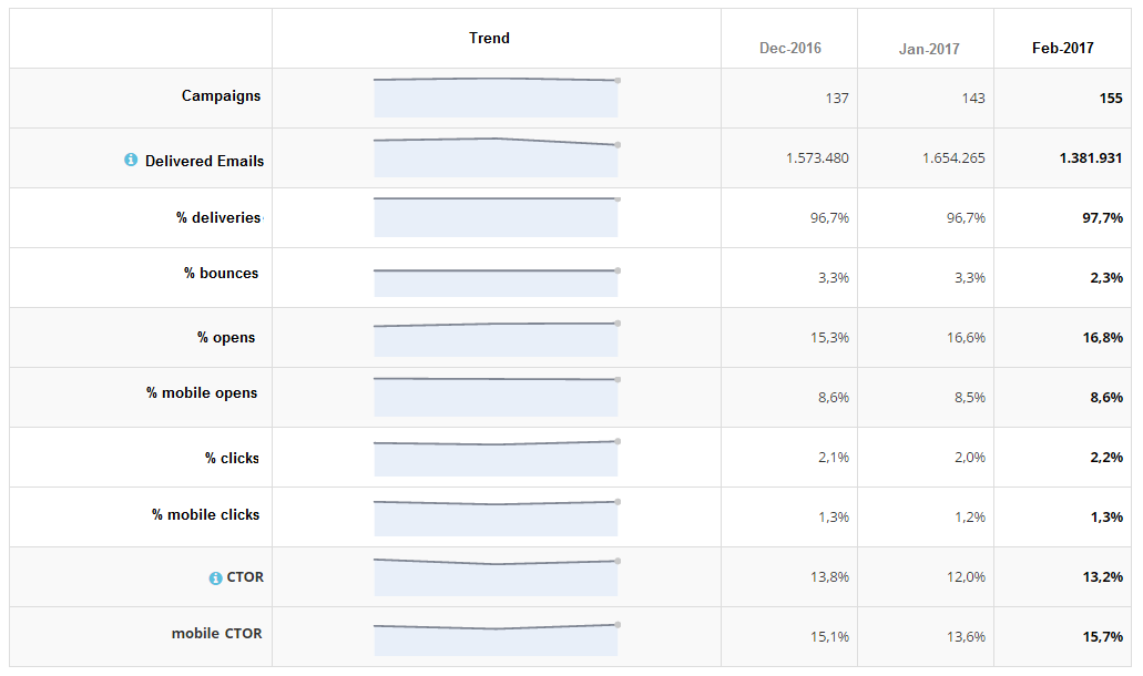
If we look at the Campaign summary below, we can see that in January and February, the number of campaigns increased. This happened, because the company concerned made the decision to accurately segment their customer base, and send highly targeted promotions to each group of contacts. That means a greater number of campaigns, sent to small groups of contacts.
We can clearly see the positive effects of this kind of strategy from the main metrics: Opens, clicks, and the click-to-open-rate (CTOR) have all increased.
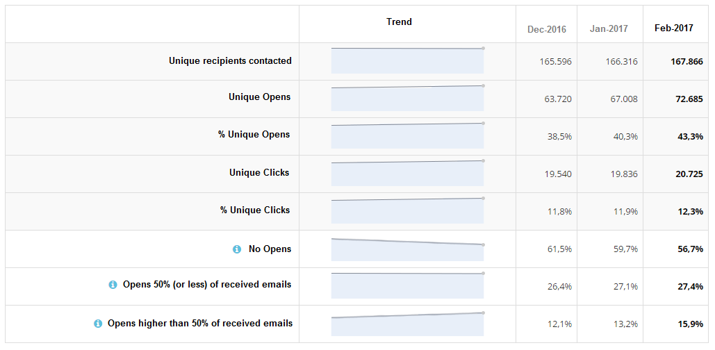
The Recipients summary confirms that segmentation is a good choice: The number of contacts who opened and clicked increased, those who made no opens within the relevant time frame decreased, and the people who opened more than 50% of received emails also increased.
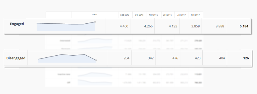
Scrolling down, we find the Email engagement index that, thanks to a proprietary algorithm, groups contacts within standard clusters according to their activity towards earlier campaigns.
Let’s focus on two clusters: “Engaged”, meaning contacts that performed many opens and/or clicks in response to recent campaigns, and “Disengaged”, or those who opened and clicked a lot in the past, but haven’t done so for campaigns sent lately.
The segmentation strategy of the company led to a fall in disengaged contacts, who turned, in the most part, into engaged recipients.
The final chart is the Pressure Index, which informs us about the sending pressure on contacts and how open and click rates change accordingly.
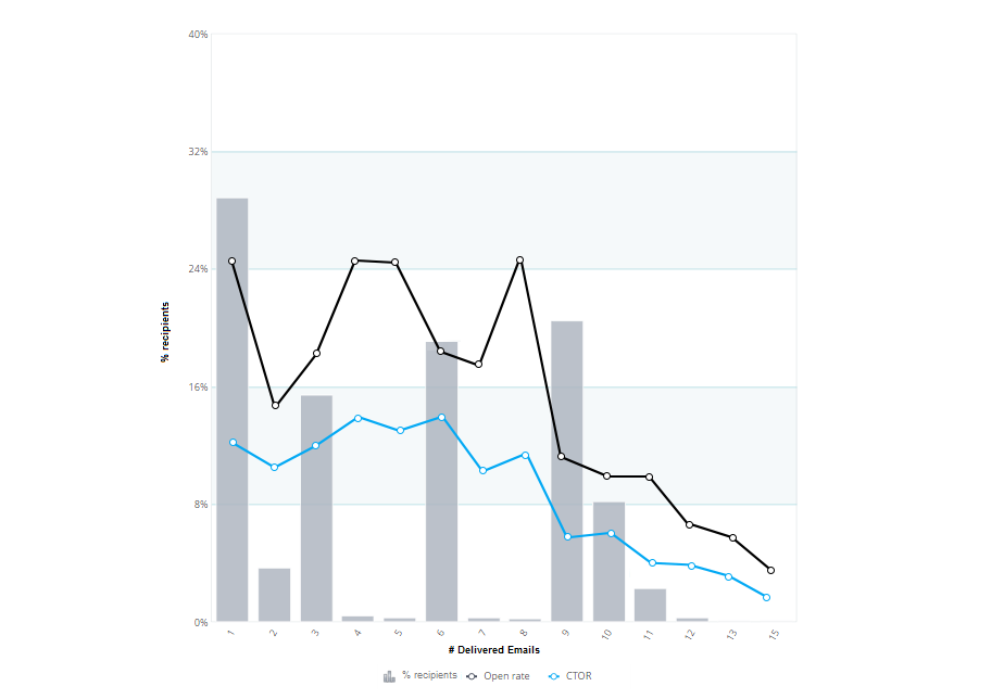
Histograms group contacts by the number of messages that they received during the relevant time period, in this case, the month of February. The first thing that we can see, is a drop in clicks and opens for people who received nine or more emails. This effectively defines a ‘do not disturb limit’ that the company should keep in mind for future campaigns.
Then we can see a few peaks. Some of these are caused by the very small number of users in the relevant cluster. For example, those who received five, seven or eight messages: In those cases, a few people opening and clicking are enough to make the trend line rise sharply.
Now let’s turn our attention to the groups of contacts who received one, three or six messages. They are also the groups who got segmented campaigns. Here, we can see open and click rates peak, while the same metrics significantly decrease for contacts who received more than nine messages… where the company made no segmentation.
To summarize, on one hand it’s better not to send too many emails to the same contact. But on the other, we can see that contacts who received six messages responded better than those who were only reached by three emails: Sending relevant and segmented communications delivers good results.
We hope that this simple example gives you an idea of how this new report can provide valuable information at a glance… useful both for seeing the effects of you current communication strategy on your customer base, and for informed decision making when planning your future campaigns.
Besides this report, we also have a dedicated team of experts that can help you analyze your campaign data in detail and build a comprehensive marketing strategy.