
Today, we again look at a subject close to our hearts, the new Marketing Cloud interface. Why is it so important? Because it is the first thing the user interacts with, when accessing the Contactlab platform.
The previous article covered the Empty State, which introduced the value of design in creating an effective and successful customer experience. Now, we continue the series with another extremely relevant component, which contributes to the unique and clear identity of an interface: The color.
The color

Color is a very important means of communication in any visual language. It represents one of the most effective ways of transposing one or more concepts from one place to another. Supported by colors, you can indicate which elements are interactive, how they relate to others and their level of prominence: The most important elements should stand out the most.
During the re-design of the platform, we used cold color palettes, because they can help users assimilate a technical interface visually. We also think this choice enhances the characteristics of all the components of the platform and reinforces the individuality of our brand. We could not achieve the same results with warm color palettes.
Because of these colors, we have enhanced the readability text, icons and similar, compared with their appearance on different backgrounds. We focused mainly on the simplicity, speed and ease of use of the Marketing Cloud – ensuring this applied to any type of screen and device – especially given that multichannel is an important aspect that we did not want to leave out.
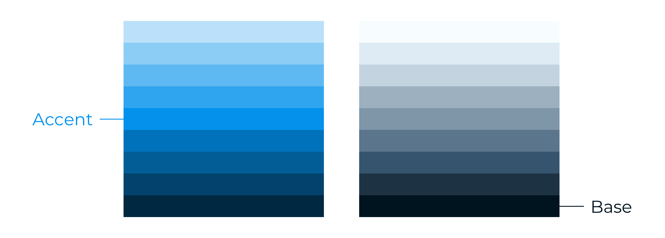
Color palettes
The system we used to apply color to the UI involves a so-called organized approach:
- A primary color, or accent.
- A secondary color, also known as the base.
For the design of the interface and all the visual elements, we adopted color palettes comprising of nine shades each, which are in turn composed of four lighter and four darker tints.
In this way, dark and light variants of each color can be applied to a UI in different combinations.
We preferred the Accent color for elements such as a Call-To-Action (CTA) which have to be highly recognizable.
The Base color on the other hand, gives us many ways to accent and distinguish selected parts of the UI. Having a further base color is optional and should be applied sparingly to accent selected parts of the UI.
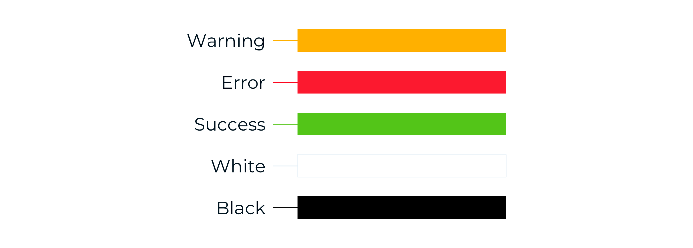
Feedback & neutral colors
Feedback and neutral colors are supporting colors. They are used to supplement the principal palettes and are mainly used to display status messages or alerts.
For example, the Warning color is intended to be used for important but non-blocking notifications. Conversely, the Error color is only to be used for error messages that require direct intervention by the user.
Combining colors
We have chosen a cold color scheme, because it allows greater flexibility in use. By not having overly strong colors, the possibility of using them increases, while the risk of low contrast effects is reduced. The colors used must, however, follow precise contrast mapping criteria.
White, black and combinations
Our palette allows you to use white and black as foreground colors. From 100 to 500 the black foreground is accessible – WCAG AA. The same goes for the white foreground from 500 to 900.
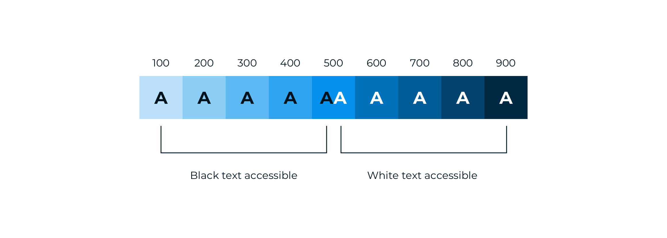
Beyond black and white text, our palette provides a range of accessible combinations. Subtracting the foreground color grade from the background color grade (or vice versa), helps you determine whether that color combination successfully meets the WCAG AA contrast ratio criteria.
If the difference between two grades is ≤ 400, the colors are accessible. Anything below a difference of 400 fails accessibility standards and requires attention.
Color in use
The significance of colors
The supporting palette is designed to be used with particular types of notification and in specific situations. Colors should only be used in these circumstances:
- Do: Use the appropriate colors to identify status, alert and confirmation messages to the user.
- Don’t: Use the Warning and Error supporting colors to accompany information unrelated to the color’s purpose.

Contrasts
All colors should only be combined according to the contrast map provided.
- Do: Use colors that are not difficult for the user to assimilate, in accordance with the contrast map.
- Don’t: Overlay colors that do not pass the contrast validation result, as displayed in the contrast map.

Now…
One thing is certain. Color transmits emotions and has a huge impact on the user. Paying attention to color means taking care of those who use the platform. The choice of one or other determines the user experience, its effects on satisfaction and the success of the platform.
In the upcoming articles, we will continue to discover why the new UI was designed and implemented as you see it today. Stay tuned!
__________________
Discover the UX/UI Marketing Cloud series!
 |
 |
 |
 |
 |
||||
| EMPTY STATES | COLOR | TYPOGRAPHY |
ELEVATION |
STRUCTURE |