
We have reached today the last appointment of the series dedicated to explore the re-design process of the new UI. A process that has been going on for a long time and is constantly evolving, driven by our desire to offer an intuitive customer experience that facilitates the use of the Cloud Marketing and allows users to get the most out of the platform.
Consumer habits and needs are constantly changing. Brands must anticipate and follow new trends and demands. The interface, which is the first reality that users encounter after accessing the platform, must consequently evolve to keep pace with new scenarios and support the business to the maximum and in a simplified way.
After dealing with empty state, color, typography and elevation, we complete the puzzle by talking about structure or better known as layout.
Structure or Layout
The layout is a technical design that promotes consistency and uniformity in the distribution of the elements and content, ensuring an optimal reading experience within a digital product.
Principles
An effective layout respects different dogmas, following the most significant for our project:
- The rule of thirds.
- The golden section.
- The Z-Layout.
- The Zig-Zag Layout.
Rule of Thirds
The rule of thirds is a principle used for centuries by painters and is still very widespread in photographic composition. According to this rule, a grid should ideally be superimposed on the design space, dividing the area into three equal parts, both horizontally and vertically, in order to obtain nine sections. In the design of a digital interface, this division acts as a guide when arranging the contents with the aim of favouring a rapid scanning of the page and avoiding that the contents are arranged too uniformly, thus losing the visual hierarchy.
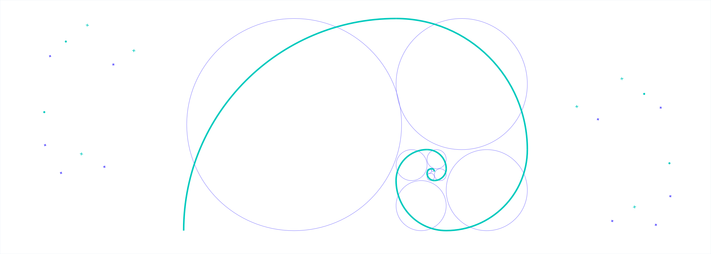
Golden Section
The golden section is the figurative representation of the golden number, i.e. an irrational number (which never ends) which is approximately equivalent to 1.6180339887 etc…and which coincides with 1.618. Difficult to explain without going into too much technical detail, let’s try it. It corresponds to the ratio between two unequal lengths where the greater is a proportional average between the smaller b and the sum of the two (a + b). So, if the height is equal to 1, the base will be 0.618. For those interested in going deeper, we refer to Wikipedia.
We would like to report it because it is one of the tools that guides the finalization of the layouts we have chosen for our platform interface. In fact, we use this mathematical proportion alongside the rule of thirds to balance, proportion and harmonize the contents.
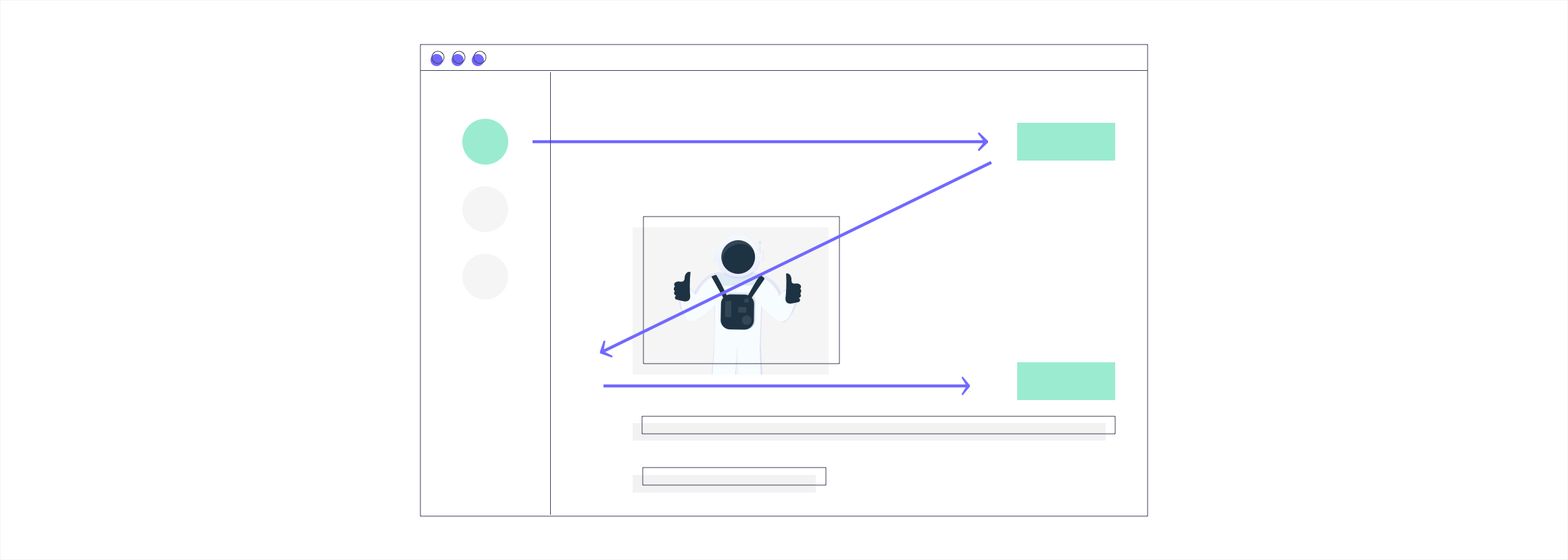
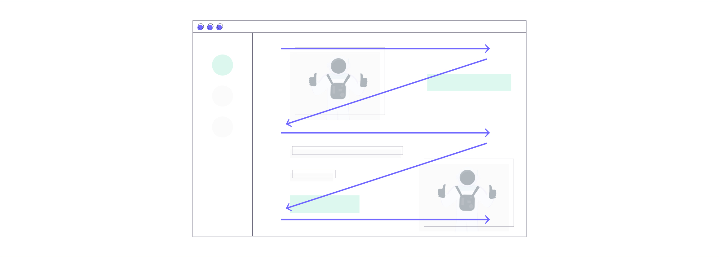
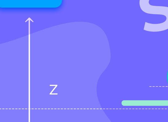
Z-Shaped Layout
Z-Layout is a solution that, if applied correctly, makes the most of a very common practice among users: don’t dwell on a single sentence but proceed with a quick scan until you find the element that attracts their attention. The Z-Layout follows this visual path from left to right and from top to bottom, forming a hypothetical Z, in order to place the contents in the best possible way. It is a solution that leads the user along a constant acquisition of information that generally culminates in the completion of an action.
Zig-Zag Shaped Layout
The Zig-Zag Layout is an extension of the Z-Layout. Unlike the first one that provides a single large movement that follows the shape of a Z, in the Zig-Zag Layout you have a series of Z-movements. The advantage of this solution is that it takes the user on a journey in which it is possible, for example, to explain in a sequential way and with a storytelling all the functions and peculiarities of a digital product.
From theory to practice
Below are some examples of structures that are a concrete representation – but not only – of the principles seen above. These structures are predefined, scalable and modular and are the expression of what we applied in the re-design of the Contactlab Marketing Cloud interface.
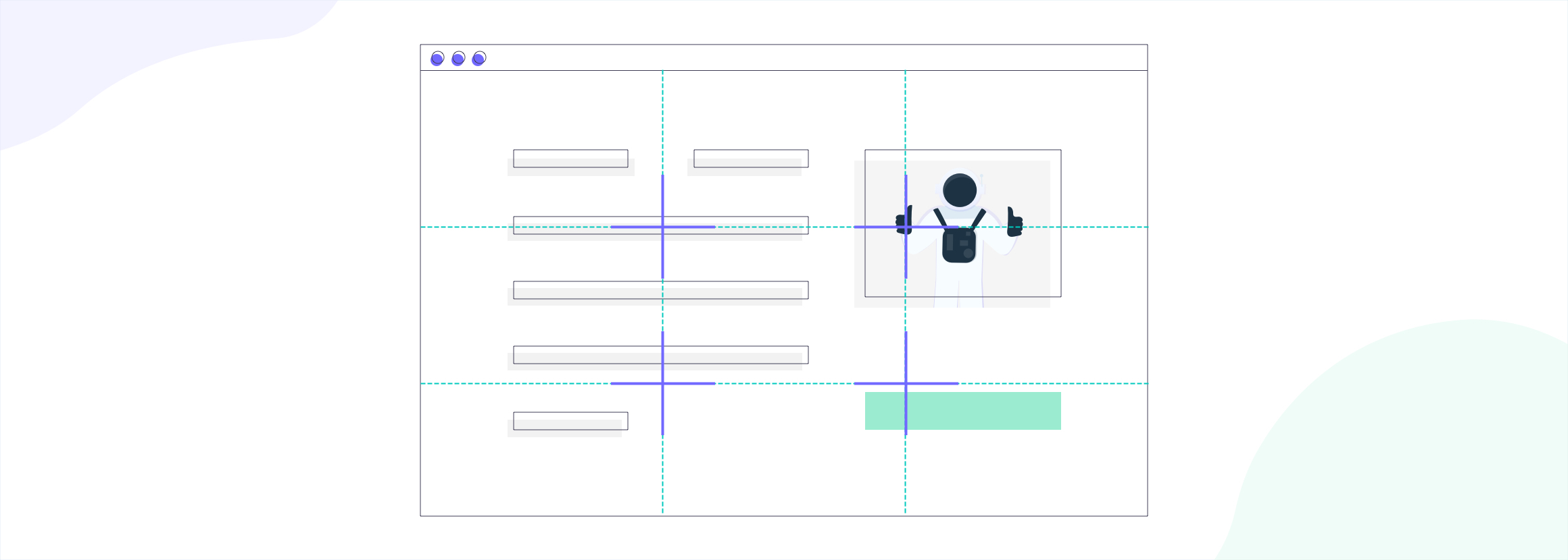
Shell Structure
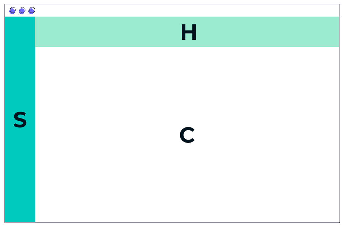 It consists of an application’s header (H), an application’s sidebar (S) on the left side and a main content area (C). The latter is the only portion of the layout that changes with frequency based on the content it is intended to display. The application’s header and the application’s sidebar cover the entire area horizontally and vertically respectively.
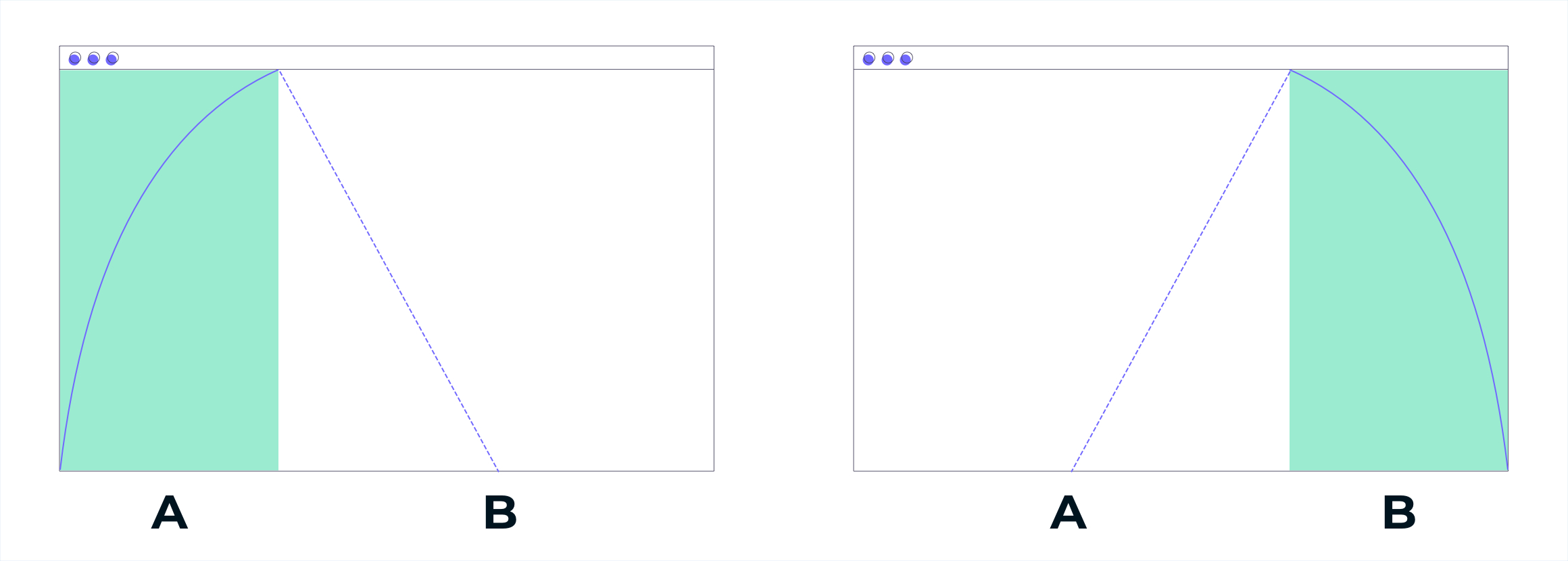
Golden Structure
In this structure the page is divided into two areas with different widths, where the application of the golden section is more visible. By making the width of the page a constant, it can be divided with φ (1.6180339887), thus obtaining the size of the largest area. Subtracting the resultant with the defined constant we obtain the size of the smaller area.
For example, take a total width of 1024px. If I divide it by 1.618 (pi – φ) the result is the size of the largest area (content of the page) the rest is the smallest area (space for possible sidebar):
- 1024 : 1.618 = 632 px (largest area/main content)
- 1024 – 632 = 392 px (minor area / sidebar)
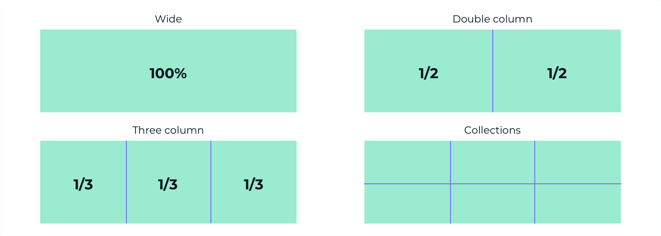
Content’s Structures
Within the application’s structures there is always a main content area that, depending on the content, can be of four types:
- Wide: it is a useful and versatile area.
- Double column: it is an area divided into two equal parts.
- Three columns: it is an area divided into three equal parts.
- Collections: it is an area that houses elements arranged on a grid inside it.
All these structures have no fixed width and they expand within the main content area of the application’s structure.
Now
One of the definitions available and applicable to our context, cites: “Layout: In publishing and computer programs, layout of a text and placement of the various graphic elements”. This is a very simplified but understandable definition, which hides a complex design work but aims to achieve a simple result instead.
In creating the new interface, we started from the very objective we wanted to achieve: an intuitive and successful customer experience. Hence our commitment to consider each of the features seen in the series and manage them in the direction of making the visualization enjoyable, easy navigation and immediate use of the platform.
We are aware that we have not touched every point and every detail as they would have deserved. There would be many topics to deal with…but we are sure that the new UI speaks for itself. For any suggestions, please contact us.
__________________
Discover the UX/UI Marketing Cloud series!
 |
 |
 |
 |
 |
||||
| EMPTY STATES | COLOR | TYPOGRAPHY |
ELEVATION |
STRUCTURE |