
Following the empty state and color , we now move on to typography and using a modular scale. The Typographic composition of different pages means presenting all the text-based elements in a clear, attractive and readable way, in a word… Harmonic.
As a result, we have paid special attention to these aspects in the re-design of the Marketing Cloud UI, always keeping the goal of creating an effective and successful user experience in mind.
Typography and a Modular scale
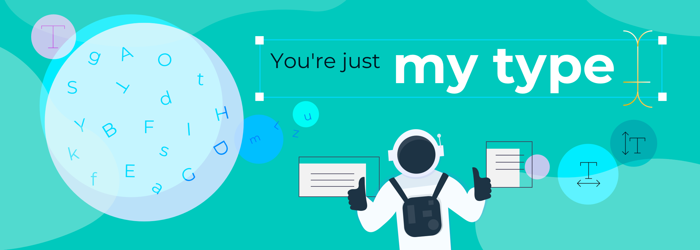
Text elements and typography generally play a very important role, representing one of the main ways of conveying information from one point to another. As a result, we decided to shape user experience down to this level.
As often happens, the main challenge in our case was to be able to establish how to use them early on. Each element can communicate different messages and emotions, based on how it is used. We need to know how much we want to take advantage of these aspects from a design point of view. After all, they could represent up to 85-90% of any screen and in our case, in some areas, it is exactly like this.
Typography is often one of the foundation components that you will want to get right, as it will need to work harmoniously with other elements, like icons and UI controls. Your line-heights, for example, may even influence many other structural elements, like spacing and grids. Here are a few key areas you need to pay attention to.
Choosing typefaces
There’s lots to consider when choosing typefaces, especially if they are intended for use on the web and on-screen. You may also need to work cross-functionally with marketing teams, to fit your brand’s typefaces into your system.
In fact, typefaces can easily become a unique focal point and recognition factor, helping to subtly convey the right tone and personality throughout the users’ digital experiences. You may want to pair a display font with a more readable typeface for the bulk of the text. But if performance is a critical goal, many design systems will often leverage system/native font-stacks for different platforms, to avoid loading web fonts.
There are many things, or better priorities, to factor into your decision, but it’s a good idea to find the right balance between:
- Personality.
- Performance.
- On-screen legibility.
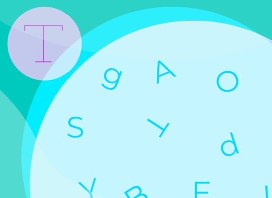
Our visual language uses the modern sans-serif Montserrat typeface.
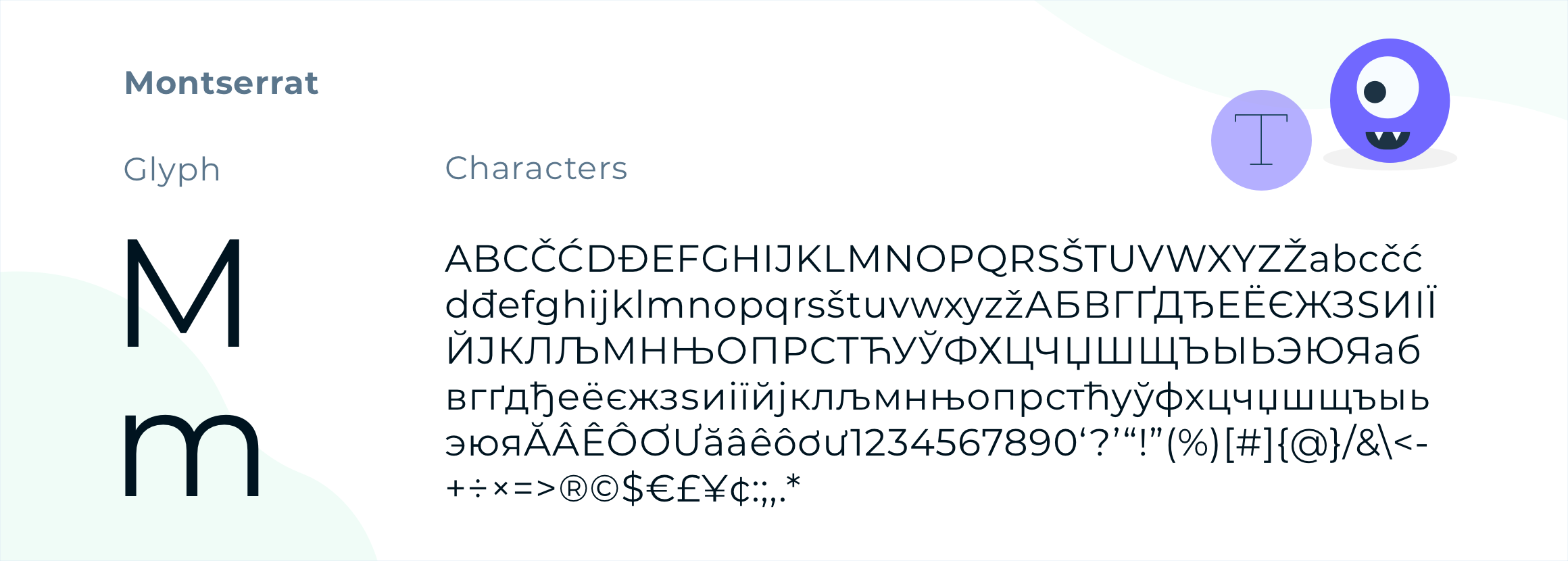
We love the geometric simplicity of the letters, especially the capitals. It really shines for short pieces in all caps. In lowercase, Montserrat is still a pretty strong font, with a nice large x-height, and in our opinion, it has a lot more character than Arial or Helvetica.
Importantly, Montserrat is released under the SIL Open Font License, making it free software according to the Free Software Foundation.
Modular scale
Using modular scales in designs, is a way to make conscious and important decisions regarding measurements on the web. Modular scales are an effective tool to use in responsive design and in grid-based systems, not in contrast to them.
In our project, they provide us with an alternative way of building our creations, and help us achieve a visual harmony, which cannot be found in compositions that use arbitrary, conventional or easily divisible numbers.
For example, you will need at least six levels of heading (h1 to h6), whether you will use them all or not.
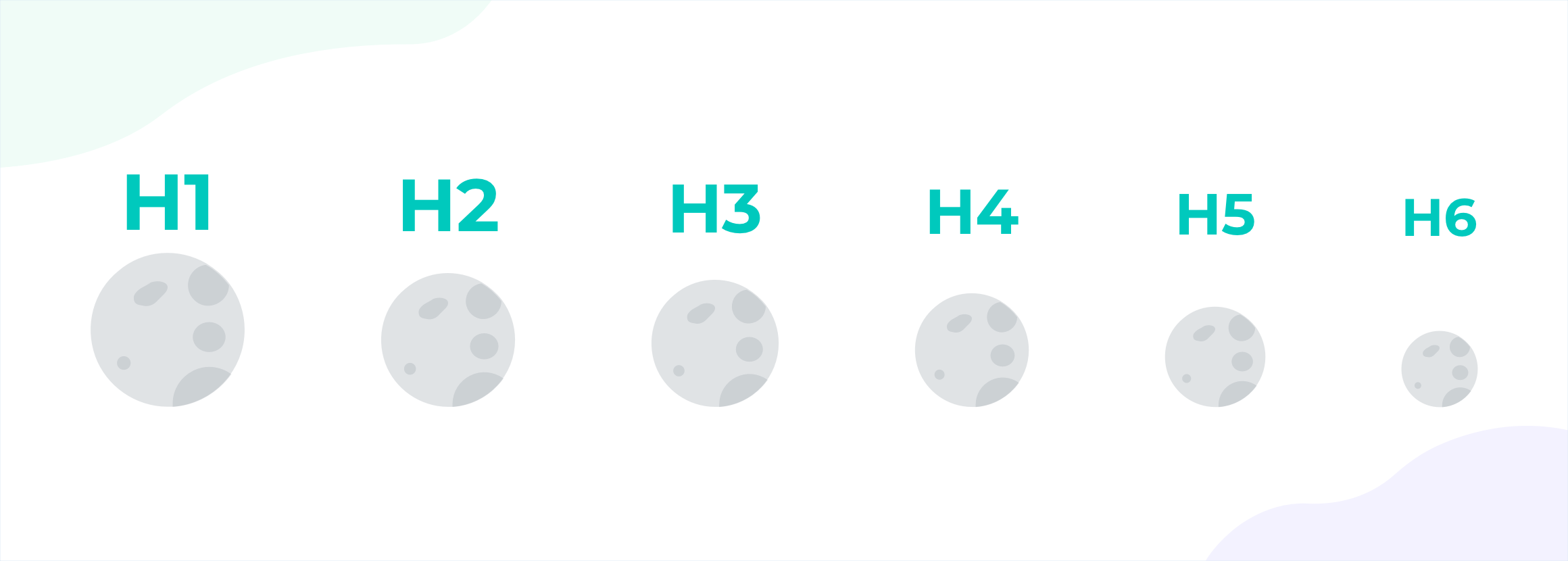
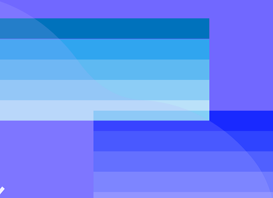
Modular scales are based on a set of numbers that combine with each other in a harmonious relationship. In a Fibonacci series, for instance, each number is a result of two previous numbers added together. If your base size is 16px and you want to choose your headings according to the golden section, the scale of sizes is made up of 16, 26, 42, 68, 110, 178, and so on.
And the result is…
It is easy to understand the impact of typefaces on a user’s eye. A well-organized page, with all the elements conceived and distributed in a proportional and orderly manner, becomes enjoyable to navigate. The possibility of the user leaving the session due to lack of clarity, for example, is reduced considerably.
In upcoming articles, we will further explore just why the new UI was designed and implemented as you see it today. Stay tuned!
__________________
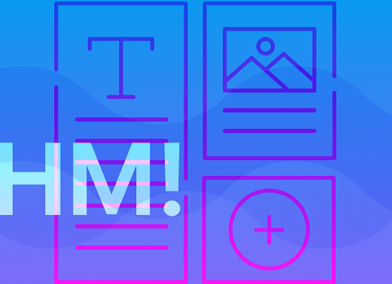
Discover the UX/UI Marketing Cloud series!
 |
 |
 |
 |
 |
||||
| EMPTY STATES | COLOR | TYPOGRAPHY |
ELEVATION |
STRUCTURE |